Our Portfolio
Showcasing our best work and client success stories

Andrisca Properties
Andrisca Properties wanted a clean, modern website that showed the quality of their building and renovation work. With over 35 years of experience across Shropshire, they needed a site that highlighted their kitchens, bathrooms, extensions, conversions and full property renovations.
The new website improved navigation, made it easier for customers to request quotes and increased visibility for local searches. After launch, the site saw a clear rise in enquiries and longer on-page viewing times thanks to the updated project gallery and simple layout.

HTR Autocentre
HTR Autocentre has served Telford since 1984 and needed a modern website that matched their reputation. We rebuilt the full site with clearer service pages, DVSA-approved MOT information and a simple online booking flow for MOTs, servicing and repairs.
The new layout helps customers find what they need quickly, and the garage now receives more online bookings than before. The improved structure also increased traffic from local search results and reduced calls about basic information, as visitors can now see everything clearly on the site.

Hello Restaurant
Hello Restaurant was created to help UK restaurants move away from paper diaries and spreadsheets and manage bookings more efficiently. The platform gives front-of-house teams a clear, real-time view of table availability, upcoming reservations and customer details.
It helps reduce no-shows through better reminders and gives managers the control they need to maximise revenue by filling gaps during busy service. The interface is designed to be simple, fast and easy for staff to use on both desktop and tablet, making it a practical tool for restaurants of any size.
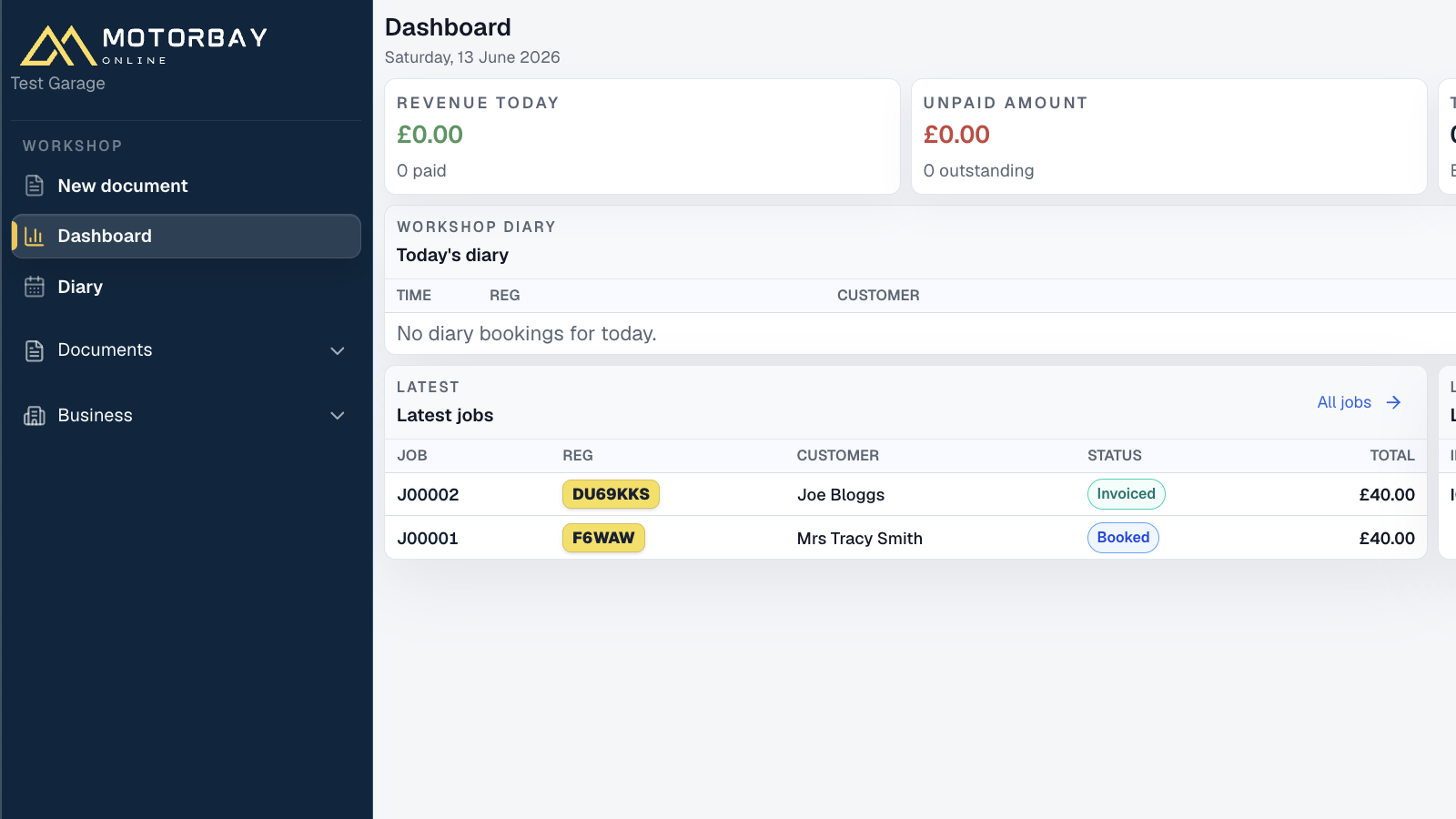
Motorbay Online
Motorbay Online needed a modern web platform for garages to manage day-to-day workshop operations in one place. We built a clean dashboard-led system covering jobs, diary bookings, customer records, documents, estimates and invoices.
The platform gives workshop teams a fast view of revenue, unpaid amounts, open invoices and daily jobs, helping them move from booking to invoice with less admin. The interface keeps key garage workflows easy to scan and simple to use during a busy working day.

HeySales CRM
HeySales needed a modern website to introduce their CRM built for real buying journeys, not manual data entry. We designed a clean, fast site explaining the product, its co-pilot features, call analysis and forecasting tools.
The clear messaging and simple structure help visitors understand the platform quickly. The site improved sign-ups for the free trial and supports the sales team with clearer product explanations and better landing-page performance.